Wednesday, November 26, 2014

Section 5-Eye of God


Outline in black, and then blue
\
Outline in red then line markings of yellow. Some characters are  rendered.

More characters are done.


All characters are done.

Painting is finished.
I started the sketch with the idea of college hazing, but it is not dark but stupid and playful. Figures are running around with diapers on their heads, some hold their diapers above their stomachs. I wanted one figure to be distinct from the rest. One figure on the top right even smashes his head unto the grass with his diaper above his stomach. I didn't paint the hair black or dark brown because I wanted the hair an autumn orange. This panel is about the camaraderie and mischievousness that occurs in a heavenly state. I believe that are an assortment of both pranks and games, and not all of heaven is grim and serious.

The sketch

Layer of black then blue then red


On an earlier sketch I had sketched some angels. They are mannish angels with long skinny bodies flying overhead with wings like clouds. I originally had these figures in a sketch I decided to throw away but I saved the section. They are not the generic heavenly figures and appear human and common. Overhead I painted some hybrid angels again instead this time they are more like humans with the wings of a bird. At the bottom of the painting I painted some mini gods. They look like a little bit like Siegfried from Siegfried and Roy with the perfect blond hair and a glamorous and sleek look.

The main attraction is the architectural frame which looks like the inside of a Gothic church  There is almost a theatricality and grandeur to it .The frames move upward  to the top which looks like an glorious apse. The sides of the frames contains little tree scenes.


Thursday, November 20, 2014

Eye of God Section 4


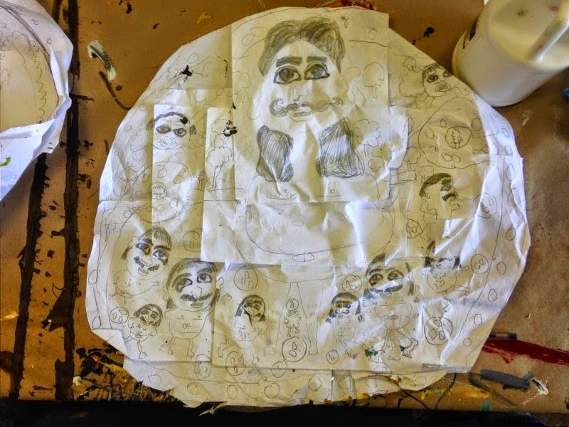
I start with a line drawing
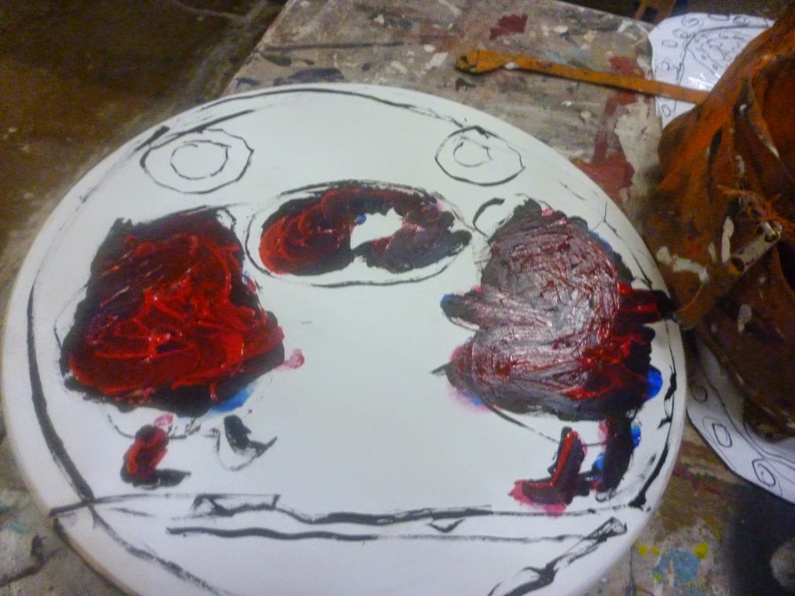
Then I fill in the shapes with black, then blue, then red.


The people and eyes painted.


 The background being filled in with blue and some of the grass is filled in.


I started off the sketch with a sketch of a group of Egyptian cup bearers who hold no cups. I was concerned with the job that the cup bearer represents rather than showing the actual pots. The first
reason I chose the cup bearer was because it seemed like an arduous task but nevertheless to a degree
not completely necessary. But I think unconsciously I knew that this profession had a noble honor to it. A cup bearer is a worker for a king who performs a sacred task as well being trustworthy and loyal to a king.. 

(Example of a Minoan cup bearer)
I really love how in Egyptian art there is a repetition of figures. Also there is a hierarchy. Figures that are powerful are bigger, and the lower peons are smaller. Even though the angels flying overhead
don''t represent that position.
The kings are actually the eye of God. He is watching over us. But he is watching over us in all directions. I chose to flip the figure to offset the composition and make it less symmetrical..
I decided that the landscape be different. In other paintings I have painted cypress and other trees.  Whenever I think of the stereotypical happy landscape I think of hills and a sunrise. It isn't painted happy, But I did want to convey some of that idea. I also decided to add the landscape upside down to resemble the movement of the heads.
I added some angels in the top of the painting. These are old Christian angels.It occurs to me it's odd I add Egyptians and a Christian theme together. It's both old religion and new religion mixing together. But spirituality is universal. I also just did a Google search and found there are Egyptian angels which I never thought existed before.But for this painting to be consistent I'm staying with the Christian angels.
I wanted to continue the little circle frame inside the big frame. I added two little frames on the top of the painting. Each of them include a little person with a big eye. I made one of the eyes bigger to emphasize the
power of the one omnipresent eye.
The drawing
I actually painted a sketch over a sketch I did of the painting I decided I didn't like Shortcuts in layering on this one. I think I did black and then red paint..


Me doing the main figure


Me doing the main figure and the little figures. Painting the frames.

Finished paintnig

I started with a sketch of a jolly fat baby. He is larger and is the king in this piece.. I painted
a frame on the left of him of an angel with wings that are attached to his body. He does not have arms. He is a a hybrid between human and angel, but more angel than human. I again decided to have trees be pedestals except this time the trees hold the gold frame with the person inside.
I drew some little fat babies. I thought it would be predictable if I put the babies on land. They are not flying but floating in the middle of the sky full of clouds.
The angels are at the bottom of the painting. Angels are usually painted in the sky. I decided that wasn't remarkable.. I painted a frame that comes into the near middle of the picture.
It looks like one angel is going to hop out of the frame. His foot is even on it.


Thursday, November 13, 2014

Eye of God Section 3

I start with an outline of the figures and landscape, and fill it in black.
I then layer the figures in blue.
I then layer it in red. I've been doing this process for a couple years now. It always
me to subtly put form and build small layers of marks with opaque paint on top of it. I then build a caricature on that form  I use abstraction and distortion to the point where the humans look cartoony.. I then fill in smaller faces. Then I paint the background. For the past couple of years it has been decorative motifs like circles and dots. Lately though it has been landscapes.
I start by filling in the figure with yellowish flesh paint. I apply paint
with tiny brushes and finger painting. 

Two figures are done.

I had painted the figures in a more illustrative style like The Little Prince   The line is more delicate and less a big black outline that is more typical of my work. The figures resemble a jolly king. I wanted two such figures to create a joyful and whimsical narrative.
I decided to place several gold frames within the picture. They all display little vignettes of landscapes of trees. I added the circle in the middle as an unusual way of adding the angels to the scene. They are in a big little bubble flying and staring out at the audience. I added trees in the middle as almost a place holder for the bubble.
I wanted a soft misty sfumato look for the background and thought about a  blue typical of a Rococo painting. For the bottom of the painting I wanted to include tons of trees amongst the circles. I changed my mind and chose to simplify and incorporate more blue sky.
Drovers and Shepherdesses in an Idyllic Pastoral Landscape by Isaac de Moucheron, an example of a soft Rococo sky
The sketch
The outline


Black fill in
Blue layer 

Red layer

Finished painting. I added more of the Rococo blue background. I also have little flying angels behind him.

I portrayed God as kind of like a Rocky figure with a prizewinning personality. He seems like he's ready for a fight. I was bored with the usual black, dark brown color hair I had been painting for the last couple of works. I decided to give God and his angels blond highlights. For some reason the God resembles the type of characters in one of the old Russian movies similar to Barbara the Fair with Silken Hair. He has a magical European presence and seems very wise .
I also used more of the Rococo blue that I had in the last picture I chose not to include any landscape in this one. I find the blue very calming. The picture to me looks like they're in a a state of bliss in the Heavenly Gates.

Saturday, November 8, 2014

Eye of God Section 2


The sketch


I wanted to do a sketch where the a frame enters into a picture and contains a frame In this picture there are two frames that gain entree in the picture on the top right and top left. I also wanted carefree people running around joyfully on the grass. In these pictures I choose a color palette of sky blues and light greens. I believe these colors are simple and carry a light and breezy narrative.
The tone waas different from the sketch to the finished painting. When I finished this painting I immediately thuoght Aztec I remember in my Chicano history class we learned of a violent Aztec game that would happen with a similar circle with a hole in it.  Maybe unconsciously I was channeling this. In the sketch the silver balls were little earth balls. But here they look like soccer balls. Iin the after life maybe it is not all
peaceful. There could be a violent battle. Or maybe there are competitive sport games?
The ball game I thought about


 "

When I did this sketch I saw a mother chicken looking after her chicks. This drawing gave me a maternal vibe which wasn't the direction I was going for in most of the sketches. I was thinking of God as a dominant masculine presence. But it occurred to me that maybe God is both maternal and paternal.I was drawing the sketch in a round way when it occurred to me to draw a frame curling in on the left. I think it adds more of an unpredictable and disjointed presence. I wanted to add more of an angel prseence in my work and continued the theme here The tiny figures are angels with wings.


I started this sketch with the idea of the two Egyptians being twins. Twins has been a constant presence in my work apparently starting unconsciously. I remember a person at my Skyline Loft commenting on the symbolism of twins and birth in a picture "Red Dot Fever," I have also done a more obvious series with me and my twin as spirit babies in heaven.
 To digress, I am a twin. As a twin you grow up thinking of a person before yourself. It's odd to think a three years old would know the value of benevolence and sacrifice. But being a twin gives you that gift of honor and kindness.I do think there is a fascination with the idea of a doppleganger or a person that could be your psychological or visual equal. I decided to make them unearthly.They don't have a regular body with legs. They are like ghosts. 
I didn't want this sketch to be symmetrical. It would be cool to mix up the pictures so viewers get a range of designs and compositions. The twins are off center. Trees are scattered throughout the picture. Some are floating, others are at ground level. I wanted some faces to level the top half of the picture. There are two big heads with angel wings.
I chose to add some circle frames in the middle of the picture.These circle frames would not be connected to the central frame. Three circle frames are floating on the top left of the picture. The twins have a frame circling them except that this frame does not have an open circle. The middle of the frame is a frame. I wanted more of an industrial look.

I outline the lines in my paintnig. Under layer of red. I start with painting the eyes,

I paint the background color. I do some of the faces and eyes.


I started this sketch knowing that I didn't want a single central figure. I wanted figures standing side by side in some sort of procession. This panel would be one of more softness and elegance. I wanted a picturesque kind of olive tree,  ..A tree would be painted with impasto like dabs of paint.In some of the colums of the Farnese ceiling some areas of mainly landscape are separated by a frame. I admire the idea of unfocused landscape being important enough. The bottom of the picture has no figures. It is just trees.
At the top of the panting I wanted little flying angels with a flowery element. I immediately thought of this section of the Farnese ceiling. Except the figures overhead are carrying potpourri like bouquet of flowers.


Thursday, November 6, 2014

Eye of God Section 1

This work was started by dreamily thinking of Farnese Ceiling by Annibale Caracci. It's very ethereal almost roocoo in its ability to be light and fanciful. I love the flying angels and the trompe o'loeil elements of golden frames sectioning the piece in different panels. I also love the green mythical scenery as well. In my work I will also use these artistic devices.
The first instinct I had was to use wooden circles. A year ago I found a circle in the lumber section at Home Depot. It's ornamental and a very open shape. The circle also has a kind of magical feeling to it. I found it different to paint on. It has no end or beginning. It is elusive and freeing.
 My studio Warehouse 1005 has a room for solo exhibits. I did an exhibit a couple months ago. In this exhibit I thought of all the pieces being the same and cohesive.I thought more about the idea of exhibit versus just art pieces.I started to think bigger and more conceptually.  For this exhibit the room will be covered in circles which will surround the room and visually unite it.
The idea of this piece will be about the Eye of God.It does seem like a heavenly force is watching over us. At church I was raised to believe he was all powerful and all knowing. I imagine God as a figure with a Persian or Egyptian eye. I was impressed with Egyptian art. The eyes are forceful, majestic and royal.I also love Persian miniatures because they are intimate and tiny. It occured to me later that I chose the circle board because it resembles an eyeball.
Every time I think of God I think of the preexistence. As a person raised in the Mormon church we are taught we existed before we were born as spirit babies. My whole life I've wondered about these spirit babies. I imagine them free and youthful running around. I think as God as a kind of big spirit baby among the children. The angels and multiple figures are the spirit children. God is running around in a diaper with a golden safety pin. He is special and holy.
I have started about three pieces already. But the paintings are not all painted yet. It will be good to map my journey.
For this project I've sketched unusually. Usually I sketch on 8X10 pieces of paper. But this time I worked different. I start with a figure which I make up in my head. It starts with the eye and the face and then figure comes. I extend that sketch with more paper and mailing tape.At the end I cut the paper into a circle. I I don't know why I'm sketching bigger. Maybe my ideas can't get through on a thumbnail sketch. I know not everything in the sketch will be painted on the panel. In the painting process I will simplify. But it still will be visually close.


(An example of a sketch of mine. Will outline future ones in pen so they can be seen better)
A sketch for one of the paintings
I have painted three so far.

Next blog I will show how I do a painting step by step to the final project.
I hope I will learn a lot. I am not that much of a writer and it isn't my forte. But I believe I will be able to express myself better with practice.